Other economics
Inflation, interest rates and all that stuff
ABS data suggests that CPI inflation may have peaked and is now falling, but is the Reserve Bank too concerned with year-on-year indicators?
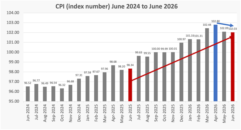
The consumer price index, the Reserve Bank’s main indicator of inflation, continues to fall. In April this year it peaked at 102.80. By June it had fallen to 102.03, the second consecutive month of fall. If sustained, that would indicate a 4.4 percent annual fall, suggesting that Australia is facing a serious deflation problem. The case for a cut in interest rates is strong, but it may be rash for the RBA to cut interest rates based on two months’ observations: its wisest move would be to hold rates for now.
That’s a straightforward interpretation of the most recent CPI index, released by the ABS on Wednesday. It’s not what you’re likely to hear from the RBA, however, when it next meets, on August 11.
Using the same source – the ABS data – the RBA is likely to note that the CPI has risen from 98.34 in June last year to 102.03 in June this year. That’s a rise in “headline inflation” of 3.8 percent, the initial indicator posted on the ABS website.[1]
The different interpretations are shown on the graph below: the blue line shows the two-month change (a fall), while the red line shows the twelve-month change (a rise). Note in particular that the CPI in June 2025 was particularly low, which means the twelve-month figure was bound to be high because it comes off a low base.
A further graph showing how different groups of expenditure have contributed to the CPI presents more evidence that the CPI may have peaked. This is shown below. The strongest percentage point contribution to the CPI was in March, and since then the contribution has been falling. Mathematically that means the second derivative of the CPI has been falling: that’s a pretty good pointer that the series itself – the CPI – may be close to turning.
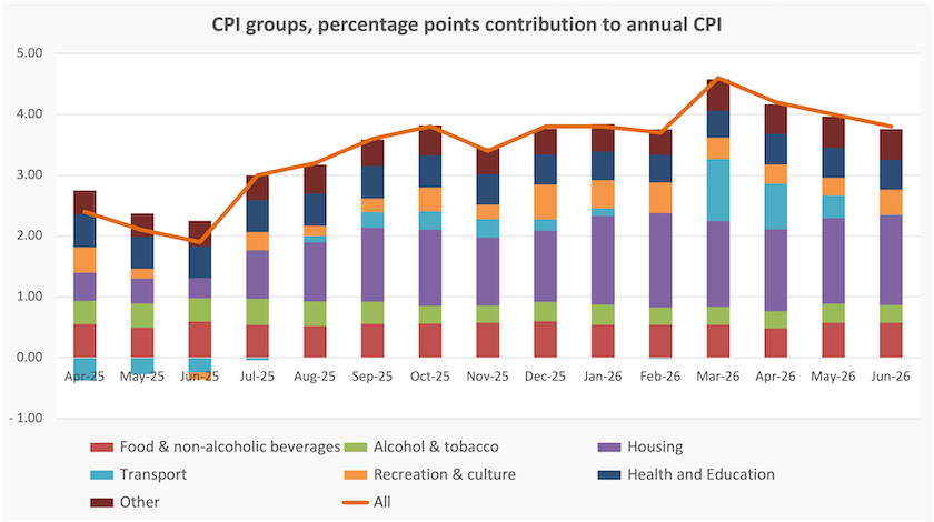
Note, in passing, the significance of the housing group – the big purple component.
Gareth Hutchens has a copy of the same graph on his post explaining the CPI figures: Headline inflation softer than expected in June, but rate hikes not off the table. The view among economists he quotes is that these latest CPI figures weaken the case for a rise in interest rates.
When the RBA meets and issues its statement on interest rates, will it say “CPI inflation is 3.8 percent”, (with an adjustment for the “trimmed mean”), based on the twelve months to June, or will it point to these more recent signs that CPI has possibly peaked and is likely to be on the way down towards the two to three percent target range? This is not a semantic point about wrongly using the present tense for a past development: it’s also about a bias in the way the RBA interprets data.
A reserve bank should be concerned with future inflation, rather than indicators of past inflation. Provided the noise can be knocked out of the figures, a recent three-month estimate should be better than an indicator that goes back a year. And indicators of coming inflation (or deflation) would be even better.
The index numbers are important, but more important is an understanding of the factors driving those index numbers: are these once-off price adjustments, or are they likely to be self-replicating drivers of price increases? The RBA should focus on the latter.
1. Observant policy nerds will notice that the ABS reports the headline CPI to be 3.7 percent and 3.8 percent on its site. That’s presumably because the fully expanded figure is 3.75228798. Round up, round down? Journalists and others place too much faith in the precision of ABS data. ↩
The sad story of housing productivity
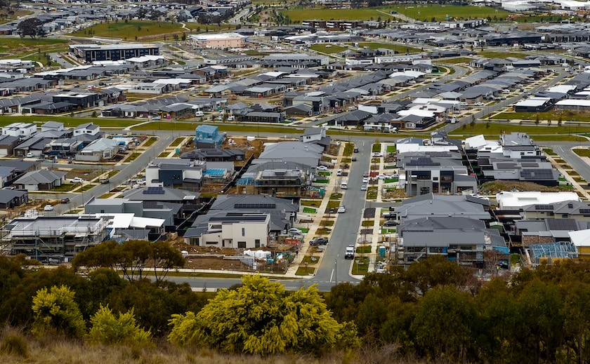
A mighty task for a cottage industry
The Productivity Commission looks at the way we build houses and discovers a cute cottage industry.
Why does it take so long to build a house, and why is the task so labour-intensive?
These are some of the questions addressed in a Productivity Commission Research paper Housing construction productivity: Can we fix it? It’s an important issue, as illustrated by the contribution of housing costs to CPI inflation, and concern about cost overruns in the construction industry generally.
The researchers’ most extraordinary revelation is that we were better at building housing thirty years ago than we are today. They found:
the number of dwellings completed per hour worked by housing construction workers has declined by 53 percent.
This may be an unreasonable comparison, because the housing we are now building is probably better than it was 30 years ago. Even so, they found:
gross value added per hour worked – a more comprehensive measure that controls for quality improvements and increases in the size of housing – has declined by 12 percent.
This is extraordinary because over the same period in the broader economy labour productivity has increased by 49 percent.
When they dig into the data they find that poor labour productivity is concentrated in the construction of free-standing houses. By contrast productivity has been improving, albeit only slightly, in the construction of higher density housing – townhouses, units and apartments. This points to particular and worsening diseconomies in once-off construction, contrasting with economies to be gained in small batch construction.
They classify the problems they identify under four headings:
Complex, slow approvals. They note that there can be extraordinarily drawn-out approval times, particularly for new housing estates and apartment complexes – up to ten years or more.
Lack of innovation. They point out that “the sector has been slow to take advantage of digital technologies and new processes like prefabrication. Low levels of innovation arise because of fragmentation, industry culture, lack of direct benefits to firms from innovation and the ‘chilling effect’ of frequent regulatory changes”.
Lack of scale. “The average residential building construction firm employs less than 2 people.”
Workforce issues. The regulatory system around occupational licensing and apprenticeships, as they describe it, seems to be out of date.
As may be expected from a Productivity Commission paper, their first suggestion for solution is about burdensome regulation:
Policymakers must balance the benefits of regulation – including neighbourhood amenity, reducing carbon emissions, building accessibility, build quality and safety, liveability and environmental protection – against the decrease in construction productivity and housing affordability that such regulations cause. Currently, policymakers do not get this balance right, and one of the consequences is poor construction productivity and less affordable housing.
Yet the problems they mostly mention have to do with poor regulation – conflicting standards by different agencies, slow bureaucratic processes, prescriptive regulations that stand in the way of innovation, and inconsistency between competing jurisdictions. In fact their recommendations are more about regulatory reform than a push for deregulation.
They touch on what they call “pipeline” issues. These are about matching supply of construction resources, particularly skilled workers, with changing demand, which in turn can be influenced by government policy. But they stop short of a full criticism of government macroeconomic policy.
In fact the demand for housing is highly sensitive to fiscal and monetary policy, which in turn tends to move counter to the business cycle. The construction industry becomes the most heavily affected by these fluctuations. Furthermore when counter-cyclical spending is at its peak, so too is spending on big infrastructure projects, attracting resources away from housing construction. (The researchers acknowledge this particular problem.)
This volatility in fiscal and monetary policy may lie behind some of the problems in the industry. It’s wise business practice for small firms to stay small in such a market: a sole trader can pack up shop in a quiet time and work in some other industry. The consequences are far worse for a more capitalised business that has grown, employed and trained skilled workers, and invested in new technologies.
It also means that long-term business relationships, and harmonious relationships between companies and unions, don’t develop in the way they can in other industries with more stable markets.
The sad story of union membership

Place of women’s business
Trade union membership is only 13 percent of the employed workforce. That’s bad for capitalism.
The two top people in the ACTU, President Michele O’Neil and Secretary Sally McManus, are resigning. There’s nothing political to be read into this: they have held those positions for many years and are making way for new people.
You can hear O’Neil on an ABC Breakfast program – It’s the right time – reflecting on the union movement’s recent achievements in persuading the government to improve conditions for workers, particularly lower-paid workers in precarious occupations.
She notes that after many years of declining union membership, the latest data – up to 2024 – shows an uptick of membership, particularly among young people.
The long-term (50 year) history of trade union membership is shown in the ABS Trade union membership data, from which the graph below is constructed. You can see that uptick to which O’Neil refers in the last data point.
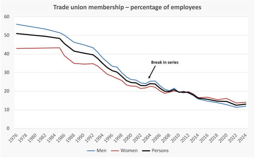
Union membership is still comparatively strong (> 20 percent) in industries dominated by the public sector – “education and training”, “public administration and safety”, and in “health care and social assistance”. That’s one reason the typical trade unionist is now a woman, and that the ACTU’s top ranks have been occupied by women. It was a very different picture in 1976 when the series starts.
But union membership is very low in low-paid private sector service industries, such as “accommodation and food services”, where it is 2.3 percent.
It is strange that this long-term decline in union membership has passed largely unnoticed, receiving far less attention than economic series on productivity or consumer prices, for example. It’s as if it’s just an inevitable byproduct of structural changes in the economy, such as the decline of manufacturing. In fact there are many on the right side of the political spectrum, ignorant of basic economics, who see the decline of union membership as a positive development.
That is to forget the economic history of the twentieth century, when in industrialized countries, using the power of collective action, unions pushed for a fair return to labour, saving capitalism from its own destructive forces. In securing a fair return to labour, they also eased the demand on government for transfer payments, freeing up public budgets for spending on public goods.
Unions won’t come back in their twentieth century form, but if our drift to destructive inequality is to be contained and reversed, they need to come back in some form appropriate to our present economic structure.
How wealth is spread
A reminder to look at median figures on income and wealth distribution, rather than average figures, because they tell very different stories.
“Money is like muck – no good unless it be spread” said Lord Bacon.
Visual Capitalist has a simple graphic giving a pretty good indication of the way wealth is spread in 30 high-income countries, derived from the UBS Global Wealth Report.
The presentation is in two columns, the first showing average wealth, the other showing median wealth, both in $US terms. The comparative ranking of countries on these scales is revealing.
The United States comes in at #2 for average wealth (Switzerland is #1), but at #28 for median wealth. That aligns with what we observe: Elon Musk’s wealth shows up in the average (total divided by the population) but not in the median (the midpoint of the population).
Norway comes in at #9 on both scales. This would be consistent with an orderly Gaussian distribution, consistent with a Nordic obsession with neatness.
New Zealand, on the other hand, comes in at $8 on average wealth, and at #3 for median wealth. Their governing National Party is presumably doing its best to eliminate this trace of socialism, but it seems to be failing.
We have a roughly similar pattern as New Zealand – #5 on the mean, #3 on the median.
A few qualifications are necessary.
The figures in the tables, and therefore the rankings, relate to personal wealth, and to figures that can be expressed in financial terms. They say nothing about the distribution of public goods, or about the amount and distribution of human, social and environmental capital.
Also they are heavily influenced by the valuation of housing. It is possible that our high ranking on both scales is a reflection of our over-priced housing. If the market value of our houses were to fall back by 10, 20 or 30 percent, we would still have the same houses. The money-based indicators of our wealth would slip, but our material wealth would be unchanged.
of an economy too dependent on weakly capitalized small businesses carrying too much debt, and on big businesses that don’t have to worry too much about competition.