Demographics
A short demographic history of Australia and ideas for the future
The ABC’s Liz Allen has a post, a “long read”: The story and us. It’s a history of immigration and population policies since 1788.
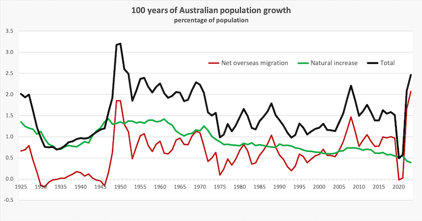
That story is partly told in the graph below, derived from her data, showing natural increase and net overseas migration as a percentage of the population (she shows absolute numbers which tend to mask some trends).

The migration story (red line) is one of two strong waves – the postwar boom and a similarly high rate from 2005 to 2020. The most recent data, going up to 2023, shows the Covid-collapse and recovery. If these were to be averaged out they would suggest that the average over the years 2020 to 2023 would be a rate of about 0.6 to 0.7 percent – a little lower than the pre-Covid years – contrary to the claim that immigration has reached a record high rate.
The rate of natural increase (green line) has been falling since 1945. Liz Allen’s chart is annotated with notable events, such as the inclusion of the contraceptive pill on the PBS in 1972, and the post-Vietnam War intake of Vietnamese immigrants in 1975. The policy story she tells is that governments have some control on immigration, and on the composition of migration – she provides a history of the White Australia policy – but governments can do little to encourage us to reproduce.
That’s our recent history. In two posts Gareth Hutchens looks at the future, urging us at least to address the question of population policy, rather than muddling through as we have been.

Earlier plans for a big Australia (Farina)
The first post – What size population can Australia sustain? Or should we avoid trying to answer the question?– looks at Australia’s falling rates of natural increase in a global context. It’s a phenomenon common to all high-income countries, most of which will fall below a replacement fertility rate within the next 20 years. It will happen in sub-Saharan Africa later in this century. He links to research showing the implications for rhe movements of people, which forecasts that there will be adverse consequences for some of the poorest countries, where birth rates are still high, which are losing skilled people through emigration, and which tend to be located in zones subject to the worst effects of climate change.
As for Australia, he suggests we need to start with an informed public debate about population policy, but so far what passes for “debate” have been assertions and counter-assertions about a “big Australia” policy, stresses on our natural resources and infrastructure, and claims about house prices. Clashing viewpoints do not constitute a policy debate.
His second post – Why doesn't Australia have a population plan? What do we want our future to look like? – goes into the specifics of what a population plan would look like, how it would relate to our broader economic structure, and how it would relate to the management of our natural resources – all in the context of climate change which is already having an effect on the regional distribution of our settlement and food production.
Is immigration the only lever the government has to control population, however? Various exhortations and rewards aimed at boosting reproduction have had little effect, but in an interview on Late Night Live, Crikey political editor Bernard Keane links low fertility to the economic stresses and uncertainties facing young people. When you have a large housing debt or are trying to accumulate a deposit, when you and your partner are paying off a five-digit HECS debt, and when you both have to work full-time to meet those fiscal demands, reproduction is an unaffordable option. (16 minutes)
Life expectancy – Australia is doing well but we should do well
The ABC’s Ahmed Yusuf reports on and summarises a report on life expectancy in six high-income countries: Australians are living longer than most people in English-speaking OECD countries, new research says.
His article goes into details of life expectancy in Australia. Out of all six countries (Australia, Canada, Ireland, UK, USA, New Zealand), we have the longest life expectancy at birth, and that success is at least partly explained by our high rates of immigration, because immigrants tend to be healthier than the native-born population.
Behind those figures lie some regional disparities (city people live longer than country people) and a stark difference in life expectancy between indigenous and non-indigenous Australians.
The report itself is on the open-access journal BMJ Open: Life expectancy and geographic variation in mortality: an observational comparison study of six high-income Anglophone countries.
The journal article summarizes the results of the study:
Among six high-income Anglophone countries, Australia is the clear best performer in life expectancy at birth, leading its peer countries by 1.26–3.95 years for women and by 0.97–4.88 years for men in 2018. While Australians experience lower mortality across the age range, most of their life expectancy advantage accrues between ages 45 and 84. Australia performs particularly well in terms of mortality from external causes (including drug- and alcohol-related deaths), screenable/treatable cancers, cardiovascular disease and influenza/pneumonia and other respiratory diseases compared with other countries. Considering life expectancy differences across geographic regions within each country, Australia tends to experience the lowest levels of inequality, while Ireland, New Zealand and the USA tend to experience the highest levels.
That last point on regional disparities is illustrated on a set of maps of regional differences in life expectancy within nations. Within Australia, the Northern Territory stands out with lower life expectancy than in other states and territories, but in the UK and the USA the regional disparities are worse, because they relate to much larger concentrations of population. The UK has a clear north-south gradient – people in south England live three years longer than Scots. The USA map looks remarkably similar to the electoral maps we have been seeing in recent times – the south and the rustbelt (Republican territory) have much lower life expectancies than the rest of the country.