Economics
Inflation: it’s now two percent, at the bottom of the RBA comfort range
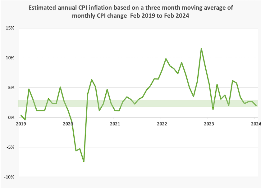
On Wednesday the ABS published the Consumer Price Indicator for February.
The standard media presentation of this data is that inflation has remained steady at 3.4 percent. That is, indeed, the increase in the indicator over the year to February, but it doesn’t necesssarily tell us what inflation is now, or over the last few months.
Between January and February, the indicator rose from 121.8 to 122.0,a change which, if maintained over a year, would come to an annual rate of 2.0 percent.
OK – that’s rough mathematics, because of rounding errors and errors of estimate, but it gets the point across: we should be looking at what inflation is around now.
As a compromise between picking up the noise of too short a time interval, and the irrelevance of data that’s 12 or 13 months old, below is presented the movement in this indicator over a three-month moving average. That suggests that over the period December 2023 and February 2024, inflation as shown by this indicator, has been 2.0 percent (coincidentally the same as one month figure), right at the bottom of the RBA comfort range shown in a green band.
In a concise presentation (2 minutes), Alan Kohler summarized the case for a rate cut. We are in a “full employment recession” he said, effectively dismissing one of the basic assumptions of macroeconomic policy. “Rate cuts are overdue” he concluded.
Understanding unemployment
Understanding the numbers
Unemployment matters because it deprives people of income and the dignity of making a recognized contribution to society through work. It matters in terms of the opportunity cost of under-utilized resources – not only labour resources but also idle capital in many cases, for example when a company drops a shift. And it matters to macroeconomists, particularly Reserve Bank economists, who believe that there is an inverse relationship between the level of unemployment and inflation.
That’s why it’s important to understand unemployment in all its dimensions, and not just the headline figure, such as the surprisingly low 3.7 percent unemployment rate in the February labour force figures.
Gareth Hutchens, writing on the ABC website, takes us through five indicators of unemployment, and three other indicators of labour market activity, all readily available: Does the surprise fall in unemployment mean the Albanese government's “full employment” ambitions are working? He shows that all these indicators are correlated to an extent, but that doesn’t mean they move in lock-step. For example long-term unemployment, almost by definition, tends to peak a year after the headline unemployment figure. And youth unemployment bumps around more roughly than other indicators, probably indicating that young people have shorter spells in and out of employment.
It would be valuable to policymakers if there were indicators of unemployment by industry or occupation, which would help governments plan for fiscal measures, such as appropriation of funds for housing, and provide something more granular for the Reserve Bank to work with than a single indicator of “full employment”. Hutchens points out the RBA considers this rate, known to economists by the ghastly acronym NAIRU (“the non-accelerating inflation rate of unemployment),to be around 4.25 to 4.50 percent.
Of course it is logically impossible for the ABS to design a survey asking the unemployed “in what industry are you unemployed?”, and it is almost as impossible to ask “in what occupation are you unemployed?”. But we do have statistics on employment by industry occupation, and it should be possible to pull together surveys shedding light on under-utilized skilled resources. Surveys could find, for example, how many people with basic building skills are unemployed, and how many pilots are stacking shelves in supermarkets. Surveys of this type might prompt action on unnecessary barriers to employment, particularly in relation to refugees.
Understanding the theory
Another ABC journalist, Ian Verrender, explains and re-examines the conventional theory that there is a determined trade-off between unemployment and inflation, and points to emerging signs that governments may be losing enthusiasm for prioritising inflation.That’s not because governments are going soft on inflation, or because there has been an outbreak of compassion amongpolicymakers, but because the idea of NAIRU and a tight relationship between inflation and unemployment may be wrong: Can Australia pull off the once-impossible with jobs and inflation?
Evidence for this changed relationship is provided by the experience of nations such as Australia that are seeing inflation and unemployment fall at the same time – a phenomenon some call disinflation, or the opposite of stagflation where both rise at the same time.
Climate change action – how hard should we go?
Last week in the piece about Joel Kotkin’s ideas (under Education, “Why are Americans becoming more stupid?”) I mentioned the risk that Extinction Rebellion’s “irresponsible behaviour” could unintentionally lead people to believe that XR’s warnings are overstatements by a radical group on the fringe, fortifying feelings of complacency and denial, and raising the risk of hostile revenge among those seeking to undermine climate change policy.
Richard Barnes, an XR activist, has challenged this interpretation, and with his permission I have put a link to his challenge on my site. He draws attention to the passion of XR activists, who are trying “to shake the public up to realise that we are facing a truly existential crisis, yet our leaders are failing us”. It’s not the usual campaign against the few climate change deniers and procrastinators: rather it’s a warning about a hard issue which even governments on the left are avoiding.
In the same comment Barnes also reminds us of David Pocock’s Duty of Care Bill, which would require the government to consider and to be guided by the wellbeing of present and future children in legislation and policies relating to climate change.(You can link to the bill, and to an explanation by the ANU Institute for Climate, Energy & Disaster Solutions: What is the Duty of Care Bill?.)
The broad context of this discussion relates to the way the seriousness of climate change is brought to public attention. XR’s protests involving blocking traffic at urban choke points bring up the question of using means that bring harm to some in order to advance the interests of many – a common problem in moral philosophy. A traffic blockage can have serious consequences for a few – missed important medical procedures, missed important exams with life-changing consequences. Barnes points out that while these traffic disruptions attract a great deal of media coverage, XR is also engaged in many protests that attract far less attention.
There are also tactical issues. Many of XR’s protests have been in our inner-city regions, where there is already a reasonably high awareness of the consequences of climate change.Is this where minds need to be changed? Perhaps they are trying to get through to those who believe we are doing enough, but that isn’t clear from their messages. Do people treat their simple and strident messages with the same dismissive scepticism that most people apply to Advance Australia’s scare campaigns?
And there is what Harvard Professor of Leadership Ron Heifetz calls the question of pacing. If those with a voice are too reassuring and concerned not to raise anxiety about a hard issue, such as the existential threat of climate change, we fail to respond to the challenge. That’s fairly obvious. But if those with a voice push too hard, they can find themselves ignored and marginalized. Good leadership involves getting the pace right, and knowing when to ramp up the pressure, while being careful to keep the people engaged. (Ron Heifetz Leadership without easy answers 1988.)
In that regard the latest Essential poll includes a question about whether we are doing enough, or too much, to address climate change. Four years ago respondents strongly believed we were not doing enough, but by now “not doing enough” and “doing enough” are about equal.There are predictable differences according to voting intention: 26 percent of Coalition supporters believe we are doing too much. Surprisingly, among those who believe we are not doing enough (about a third of respondents), there is no discernible difference depending on age.
Cash poverty and its consequences
How would you cope if you were faced with a sudden unexpected expense – emergency travel overseas to help a friend who is ill or in trouble, an unexpected dental bill, a tax liability you hadn’t budgeted for?
We can get some idea of how people would cope with such contingencies from a survey conducted by the financial comparison organization Finder, where personal finance consultant Taylor Blackburn reports on a survey of people’s bank account balances: Millions of Australians have less than a grand to their name.
The findings are not presented in clear order, snd it’s not clear whether they refer to households or individuals, or whether they are influenced by payday effects (every employee’s bank balance is $X higher on payday). We have to presume “the average Australian” is a mean, influenced by Gina Rinehart’s fortunes, rather than a median, but with these qualifications the survey reveals that:
- 20 percent of Australians have no savings;
- a further 25 percent have some savings but 45 percent have less than $1 000;
- of the remaining who have more than $1 000, the average balance is $65 000.
It may not be highly accurate, and what it reveals is limited. For example, Sydney’s Wesley Mission used to survey people’s ability to raise a specified amount, such as $2 000, for a contingency, which could be met from a person’s savings, from use of a conservatively-managed credit card, or from friends and relatives. That’s a more meaningful indicator of precarity, and of social connections.
With all its limitations, however, the Finder survey reminds us that there are wide differences in people’s capacity to deal with contingencies.
Those with a reasonable buffer of savings can avail themselves of high-deductible insurance policies, for example, which are much cheaper than “first dollar cover”, or can forgo contents insurance altogether (unless they have a wall of Tom Roberts paintings).
Writing on the ABC website Penny Timms notes that many people are dropping private health insurance and relying on their own savings should they need procedures for which there would be a long waiting period as a public patient. That’s a wise move for those who can afford it.[1]
From about 50 years ago Australians became less inclined to save, as shown in the graph below. Recognition of this emerging trend was partly responsible for the Hawke-Keating government’s introduction of compulsory superannuation. More recently one of the few good effects of the pandemic was a boost to savings – there wasn’t much to spend money on.
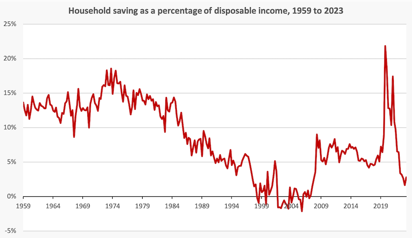
If we can come back to the savings levels of 5 to 7 percent in the pre-pandemic period, wecan be less dependent on credit cards, buy-now-pay-later schemes, insurance of all types and the finance sector in general.
1. When I was working on health policy I was able to demonstrate that a person with an average incidence of adverse health events over their lifetime, who decided to fund health care from their own resources, using private hospitals when available, would accumulate more than $100 000 savings over a lifetime, in comparison with one who held private insurance, and at the end have enough to fund a generous wake. ↩
Are you happy? The answer depends on your age
There has been a fair bit of publicity about the World Happiness Report, which ranks 143 countries (Finland #1, Afghanistan #143) in terms of people’s subjective assessment of their well-being. Australia comes in at #10, predictably behind the Nordic countries, and behind some other western European countries and Israel. (The surveys were conducted before the present war.)
One significant finding is that in some countries, including Australia and many other “developed” countries, the old (60+) are significantly happier than the young (<30).This difference is particularly strong in the USA.By contrast, in many other countries, including Eastern European countries that were once aligned with the Soviet Union, the reverse holds.

Australians enjoying themselves
In this report people’s assessment of their happiness is based on a “life evaluation” score, as used by the Gallup World Poll, generating a numerical score.
While preserving that score and its ranking, the researchers also assess each country on six more objective variables – GDP per head (using a logarithmetic scale), freedom to make life choices, perceptions of corruption, healthy life expectancy, social support, and generosity (based on personal donations).
The scores on these variables generally rank in the same order as the subjective life evaluation, but there are exceptions, most notably the countries of central and south America, where people seem to be much happier than would be explained by the six objective factors in countries with low incomes and generally lousy governments.
At another extreme Singapore stands out as a country where everything is close to perfect on the objective criteria, but it comes in at #30, well behind many less prosperous and orderly countries.
The ABC’s Georgie Hewson has a summary of the report, with the headline: Australia makes top 10 for world happiness rankings but younger people are on the slide.
Also on wellbeing the Centre for Policy Development reminds us of its Wellbeing Economy Brief – “a collection of mini briefing papers that look at the idea of a wellbeing economy, how it relates to other ideas for economic change, and what some of the core elements of a wellbeing economy are”. These briefs are largely about the ways wellbeing is perceived and evaluated, and how it can be incorporated into public policy, with some examples ofwellbeing indicators.