Public policy
The Census and its policy implications
Data from the 2021 Census is starting to trickle out from the ABS Census website. So far the media has picked up on a few key but rather unsurprising bits of information. We’re becoming more ethnically diverse, we’re becoming less identified with any religion, the “baby-boomer” generation is dying off, and men do less unpaid housework than women. Wes Mountain of The Conversation has pulled together some of these main findings as The 2021 Australian census in 8 charts.
The real value of the census comes in its long time series and fine-grained regional analysis. It’s a vital tool for local, state and federal government agencies in planning the location of services, for example. So far there are a few observations of interest to policymakers as follows.
Ethnic concentrations in urban regions
One analyst quick off the mark with detailed analysis is Sukhmani Khorana of Western Sydney University, who has a Conversation article Census data shows we’re more culturally diverse than ever: our institutions must reflect this. She digs into the data to reveal the urban regions with the highest concentrations of first- and second-generation immigrants. These have borne a disproportionate share of the burden of coping with Covid-19 restrictions and lockdowns.
A growing number of people identify as indigenous Australians
Bronwyn Carlson of Macquarie University, also writing in The Conversation, goes into some details about what the Census reveals about Aboriginal and Torres Strait Islander Australians. Notably the number of people so identifying themselves has risen from 649 000 in 2016 to 813 000 in 2021, and the growth has been even stronger among people aged 65 or more. But the Census doesn’t tell us enough about their living conditions.
Religion: Australia is secular and becoming more so
Commentators have drawn attention to the Census findings on religion: 44 percent “Christian”, 39 percent “no religion”, and 10 percent “other religions”. International comparisons, prepared by the Pew Research Center, confirm that Australia is among the world’s most secular nations – similar in many ways to western Europe.
Notably Australia is very different from the USA, where 63 percent of adults identify as “Christian”, 29 percent as “no religion” and 6 percent as “other religions”. In both countries the trend away from religious affiliation is similar, but within the category “Christian” the Australian and USA figures are radically different. In the USA 60 percent of “Protestants” (a category that excludes only Catholics) identify as “evangelical or born-again”, which suggests that around a third of Americans may be “evangelical or born-again” Christians, an identity that may have more to do with politics than theology.
We’re ageing
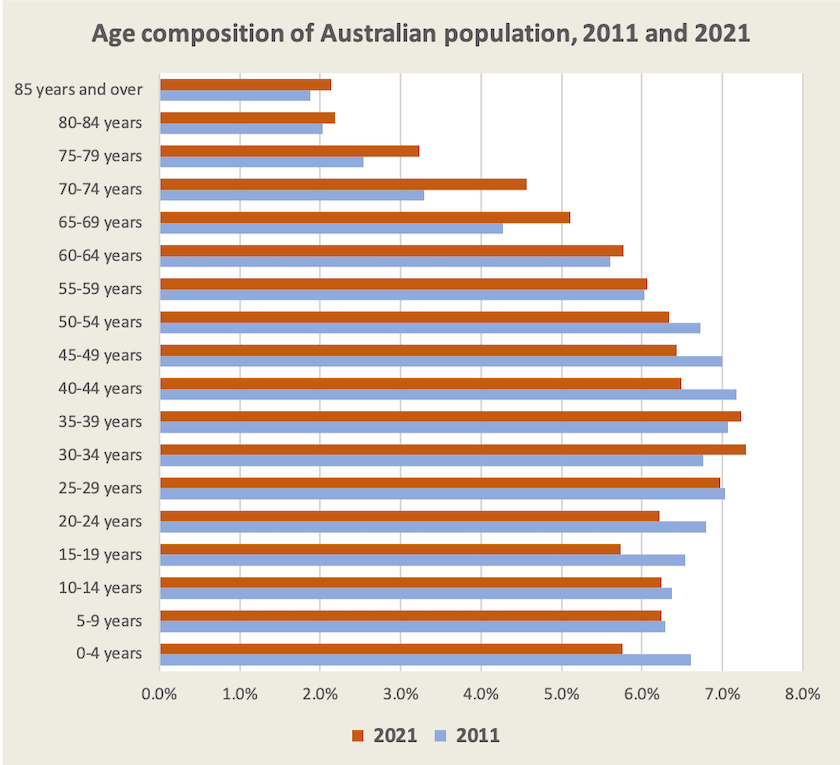
One early revelation from the Census is our changing age structure, shown in the diagram below which compares our age structure in 2021 with our age structure in 2011.

In those ten years the proportion of Australians aged 65 or over has risen from 14 percent to 17 percent. This has implications for a raft of government policy – aged care, health care, pensions, superannuation and taxation. There is also a big fall in the proportion of children aged 0 to 4, but most of this fall has been since the 2016 Census: it may reflect people’s reluctance to have children during the uncertain period of the Covid-19 outbreak.
In an article published on the CEDA website Treasury’s David Parker writes about the economic impact of Australia’s ageing population. An ageing population is less productive and more dependent on transfers from younger people still in the workforce. But he offsets this established economic wisdom with the observation that workforce participation among older Australians is growing.
We’re moving
As analysts dig into the Census figures they will find a great deal about how our regions, including regions within our big cities, are changing. Other indicators suggest that many Australians are on the move, out of our largest congested and expensive capital cities.
The Regional Australia Institute, in partnership with the Commonwealth Bank, produces a regular Regional movers index. Its terminology is annoying – it calls everything outside our capital cities “regional”, and it gets excited about large percentage changes from small bases (is Ceduna on the isolated, hot and windy far west coast of South Australia really one of our new growth hubs?) But it has some substantial findings. One is that large cities close to state capitals – the Sunshine Coast, the Gold Coast, Newcastle, Wollongong and Geelong have been growing strongly this year and that people have been moving out of Sydney and Melbourne. Net migration to non-capital city regions has increased significantly since the onset of the Covid-19 pandemic. We don’t know if this is permanent – the trend is weakening. Importantly we don’t know the drivers – housing prices, opportunities to work remotely, fear of infection, congestion?
Electricity – connecting the nation to electrify everything
The Australian Energy Market Operator has released its 2022 Integrated System Plan for the National Electricity Market. Most of the media are reacting to the plan, with its recommendation for investment in transmission lines designed to make most use of renewable resources, as a new proposal, but a draft was published last December, and on first glance it looks like an update of the 2020 Plan. This time it should enjoy a better reception in government: indeed the ISP recommendation for investment in transmission lines was one of the few major investment proposals Labor took to the election.
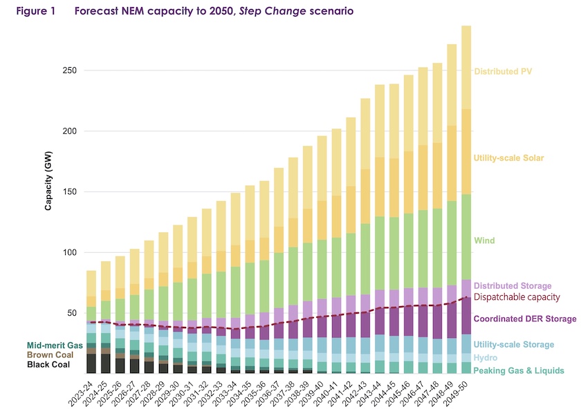
Now that we have a receptive government the magnitude of the ISP is becoming clear. It involves 10 000 km of new transmission lines, a huge growth in our electricity generating capacity (an “electrify everything scenario”), and a massive scaling up of renewable and storage resources, summarised in the document’s first graphic, copied below (in line with AEMO’s copyright provisions).

Note the rapid disappearance of coal, while peaking gas remains in the mixture. But note that this is a chart of capacity, not of likely supply – think of a house off-grid with an emergency Honda generator in the garage. Note the big growth in distributed photovoltaic solar – often called “rooftop solar” (as opposed to large utility-scale solar farms) – which electricity authorities to date have often criticized because of timing and stability problems. But “DER” – distributed energy storage – is the complement to rooftop solar. Those storage units are batteries on wheels – often called “electric cars”.
For those who want a summary of the ISP, Giles Parkinson has an article on Renew Economy: “Rapid and irreversible:” AEMO says energy crisis is accelerating switch to renewables, and Tim Buckley of Climate Energy Finance can hardly contain his enthusiasm for the plan in a 7-minute interview on ABC Breakfast. Gone is any thinking about renewable energy destroying jobs. Rather, the ISP is going to put huge demands on our labour market, particularly the market for skilled labour, for many years.
Social housing – too little
To summarise Australia’s social housing situation: the need has risen and the supply has fallen. The Australian Institute of Health and Welfare has a web report Housing Assistance in Australia, into which one can drill down to find descriptions of Commonwealth and state public housing programs and data on recent developments.
Unsurprisingly, waiting lists have lengthened over the last five years, particularly for people in the highest need categories.
The report has many revelations on the demographics of social housing tenants. There is a big bulge of young people (5 to 19 years), and of older people (55 and older), particularly women, with relatively fewer (still predominately women) in the 20 to 54 age band. Most tenants are single adults, and more than a third of households include a person with a disability.
Revenue sharing: your taxes at work for the people of Western Australia
Saul Eslake and Martyn Goddard (both living in Tasmania) have been strong critics of a 2018 Morrison government legislation that changed the distribution of GST revenue to the states. Up to that point GST revenues were distributed on the basis of recommendations of the Grants Commission, which assesses states’ revenue capacities and spending needs in order to put all states on an equal fiscal footing. The 2018 legislation, which Eslake explains in an interview on Perth’s 6PR, essentially means that Western Australia gets a top-up regardless of its capacity to raise revenue from its mining riches. De facto, it is doing very well in comparison with the other states. This was a break from revenue-sharing principles in place since 1936.
The Grants Commission, in a quietly-released paper State’s GST needs over a decade, has calculated what it would recommend without taking into account the 2018 legislation. In essence, because Western Australia has done so well out of mining revenue since 2018, every other state is relatively disadvantaged, particularly the Northern Territory, Tasmania, Queensland, and South Australia. In essence the citizens of these states and territories are subsidising Western Australia’s public finances even though it is doing very well.
In light of Labor’s extraordinary electoral success in Western Australia, and the fact that Victoria, the only other state to prosper from the deal, is facing an election on November, it is hard to imagine that the Albanese government will rush to fix this injustice.
The pandemic – it’s getting worse
Nationally cases and deaths are rising.

Possibly the rise in cases is explained by the arrival of new strains of Omicron – BA.4 and BA.5, which epidemiologists report to be more infectious than earlier strains of Omicron, and which are more likely to lead to reinfections. Although there are only a handful of recorded reinfections in Australia so far, our public health authorities are concerned that this number will rise.
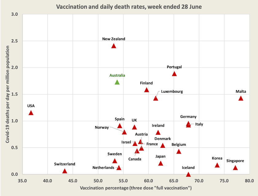
There is no such clear contender for an explanation of our high and rising number of deaths. With deaths of around 45 a day, or 1.7 per million population, we are now among the “developed” countries with the highest number of deaths per day. So too is New Zealand.

A glib and too hasty conclusion from the chart is to suggest that the high number of deaths in Australia and New Zealand is to do with winter. But we might also note that both countries have a comparatively low level of third-dose vaccination. Another possible explanation is that Australia and New Zealand had negligible Covid infections until this year, while European countries have had a degree of immunity associated with earlier infections. It is notable, for example, that Taiwan, which maintained a successful local eradication strategy for so long, now has a daily death rate of almost 6 per million, even though it has a 72 percent third-dose vaccination rate. (I’ve left it off the chart in the interests of maintaining a legible scale.)
Importantly, we cannot simply attribute our higher number of deaths to a higher number of cases. Note from the graph of Australian cases how, with a lag of about three weeks, the black line of deaths initially tracked the red line of cases. It is no longer maintaining that relationship: the rate of deaths per recorded infection is rising. In late April our death rate per recorded case was 0.050 percent, or one death for every 2000 cases: now it is 0.155 percent, or one for every 640 cases.[1][2]
A few months ago Australians were hoping that Covid would have one last Omicron surge and slowly die out, but as epidemiologists were warning, there was no inevitability in that path. It is once again a serious problem in Australia, for where there are cases there are absences from work, and where there are deaths there are high loads on our hospitals – on top of a serious influenza year. Yet on observing our behaviour in public places one may believe Covid-19 has gone away. It is little wonder that epidemiologists are calling for more awareness.
Vaccination – levels sill low
Although we achieved an impressively high level of two-dose vaccination (96 percent of adults or 84 percent of our population), our third-dose performance is poor (67 percent of adults or 54 percent of our population). Third-dose vaccination levels are particularly low in Queensland (58 percent of adults), while in the ACT and Western Australia they are reasonably high (80 percent of adults). As an observation, rather than a conclusion, it is notable that both the ACT and Western Australia have high levels of infection while they also have comparatively low death rates.
There is a chance that the next vaccination on offer will be specific to Omicron, or even to its dominant sub-variants. Moderna and Pfizer have tested updated shots against Omicron variants, and the US FDA is considering whether it is time to make a switch. Australia would be likely to follow.
A policy response
It appears that the virus has shown little respect for our election cycle or our fiscal planning. While epidemiologists, hospital staff and even retired academics noticed a rise in cases around March and saw that vaccination had stalled, Covid-19 was off the political agenda, and the government intended to end support programs for workers forced to be absent from work by June 30. On Friday’s ABC Breakfast program Health Minister Mark Butler explains how the government is responding to this latest wave and to our low third-dose vaccination level. This wave puts yet another stress on our health budget.
1. These figures are for the number of deaths, smoothed over 7 days, divided by the number of cases, similarly smoothed, three weeks earlier. ↩
2. For comprehensive data on recorded cases, deaths, hospitalizations and more, see the website maintained by Juliette O’Brien and her colleagues: Covid-19 in Australia. Data on vaccination is on the ABC’s vaccine tracker, maintained by Inga Ting and her colleagues. The Guardian’s data tracker has further select data, including reported infection rates in regions within states. ↩