Covid-19 – a story of peaks
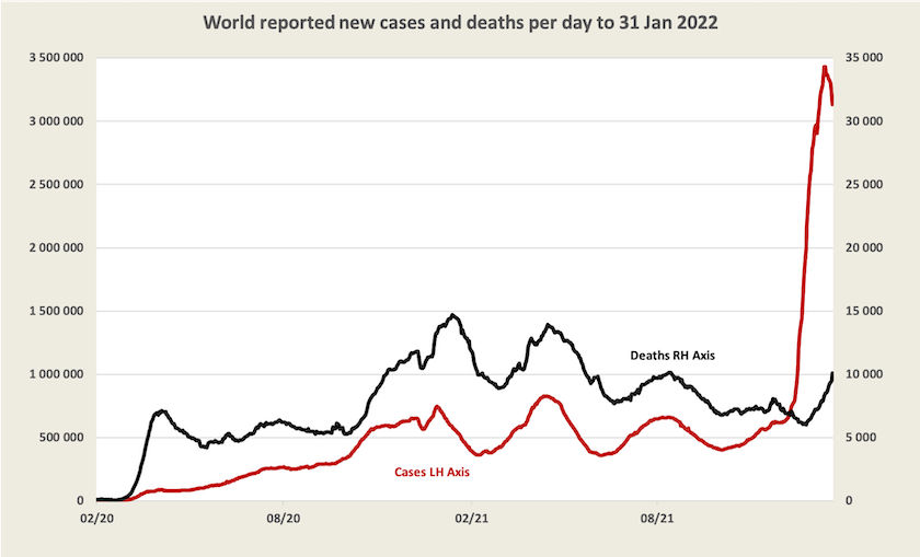
Worldwide – peak in cases, deaths to peak soon
Below is an update of cases and deaths, with the usual qualifications: in almost all countries cases of Omicron would be under-reported, and in many “underdeveloped” countries neither cases nor deaths are well recorded. The main message is that the death rate per case in the Omicron wave is much lower than the death rate from other variants. Cases seem to have peaked, and deaths should peak in the next few weeks.
Worldwide 63 percent of the population has received a first dose of vaccination, 54 percent two doses, and 13 percent three doses. With 80 percent of our population having had two doses Australia is among the most highly-vaccinated countries: in Europe only Portugal, Spain and Denmark have higher rates, and in Asia, China, Korea and Singapore have higher rates.
Australia – cases, hospital admissions, deaths – promising signs
A few graphs tell most of the story.
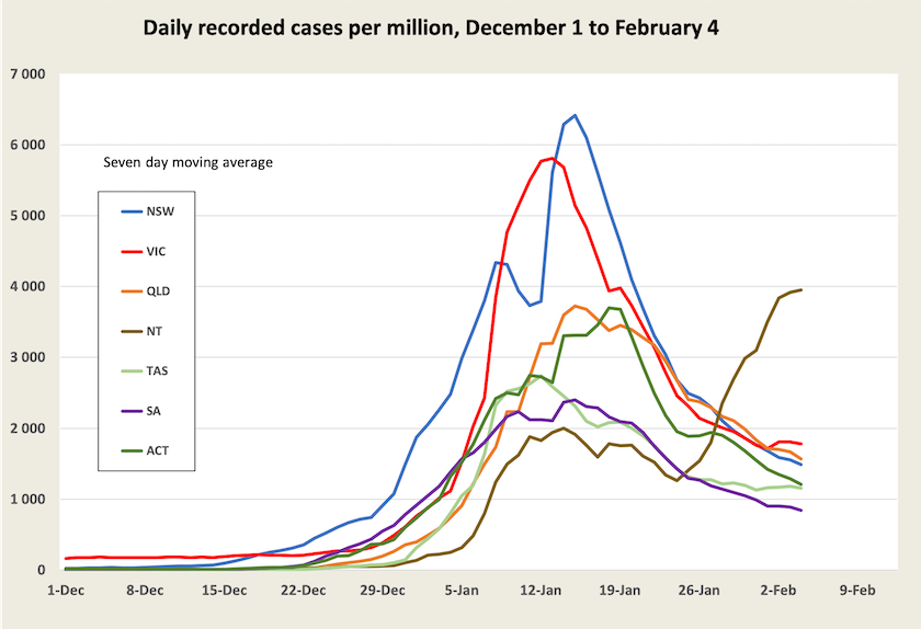
Apart from the Northern Territory, where there are particular problems in some indigenous communities, recorded cases have peaked.[1] As rapid antigen tests become more available, and as children return to school, we may see a flattening or even a rise in recorded cases. (The two-dose vaccination rate among children 5-11 is still only 42 percent, but is rising quickly.)
Up to now, with a shortage of RAT tests, it has been reasonable to assume that there would be a roughly constant ratio between recorded and unrecorded cases: that assumption is now less reliable as more RAT tests become available. But we can be sure that recorded cases report the minimum number of actual cases. In addition there will still be many asymptomatic and unrecorded cases. If as is likely Omicron has changed to become more infectious (not a new variant), the rate of infection may pick up for a while.
In comparison with earlier waves, the daily case numbers are still very high. When daily cases get above around 50 per million population, contact-tracing starts to break down. At its peak the Victorian outbreak in 2020 was 550 cases per million; cases now are still well above that level.
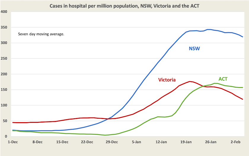
We don’t have figures for people being admitted to hospital, but Juliette O’Brien and her colleagues have recorded the number of cases in hospital (note the difference). The graph below is based on that data, smoothed to iron out the bumps. It covers only New South Wales, Victoria and the ACT, where the current wave was first established. Not too much attention should be paid to the absolute differences between these three jurisdictions because their definitions may differ, but in all three the number of people in hospital with Covid-19 has at least stabilized and is probably declining. Even if, as hospitals are reporting, few people with Omicron are being admitted to hospital, and those that are admitted have short stays, there is a long tail of difficult cases, which is why the hospital system will remain overloaded for some time. As Rick Morton wrote in last week’s Saturday Paper “Try very hard to avoid getting Covid until March”.
Then there are deaths. The graph below, also drawn from the data collected by O’Brien and her colleagues, looks scary. The normal daily death rate in Australia is about 17 per million: another 4 or 5 on top of that is serious.
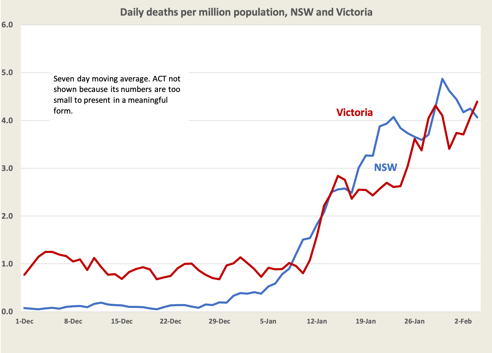
We can reasonably expect a three-week lag between cases and deaths, however, and the peak in cases was only three weeks ago: deaths should start falling soon.
In terms of personal risk, the number of deaths per recorded case is falling. Allowing for that three-week lag it’s now around 0.1 per cent, or 1 in 1000.
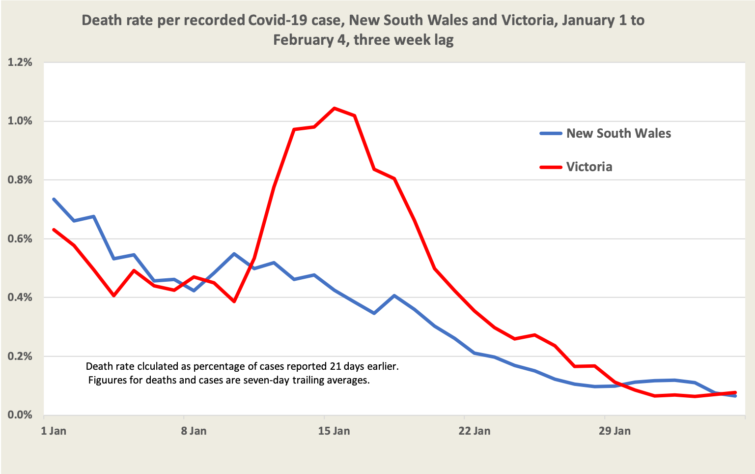
That’s an average figure, covering people of all ages and of all vaccination levels. In New South Wales and Victoria about 4 to 5 percent of adults are unvaccinated (many of them seem to have congregated in Canberra to protest), and only 41 percent of adults have received their third dose – the dose that’s most effective in preventing serious illness. In any event, this 1 in 1000 rate, because of under-recording of cases, is an over-estimate.
In summary, what the numbers tell us for that part of Australia where this wave is most advanced:
cases have peaked, but they may drag on at a high level;
the number of people in hospital is declining only slowly, which means there is an ongoing stress on our hospitals, but the number of people being admitted to hospital is probably falling much faster;
deaths are still high, but should turn around;
as an upper estimate the death rate per case is about 1 in 1000, which is much lower than in earlier waves which had rates of 10 to 20 per 1000.
As Norman Swan explains on Friday’s Coronacast, people find it hard to get a grasp on estimates of risk. We are more responsive to bad news (for example the daily reports of deaths) and less responsive to good news, but in time we become weary and start to turn off all news. But the numbers are telling us that for those who are well-vaccinated the risk of severe illness and death is very low. At least for now.
That doesn’t mean we can relax and return to a pre-Covid-19 world. As Hassan Valley and Catherine Bennett write in The Conversation: COVID will soon be endemic. This doesn’t mean it’s harmless or we give up, just that it’s part of life. It’s a nasty disease, and figures on death and hospitalization don’t tell us anything about its long-term effects. We should not “drop our guard, surrender to the virus or downgrade the threat the virus poses to individuals and the community”.
1. Western Australia is still not shown on the graph but Juliette Obrien and her colleagues include it in a chart plotted on a logarithmic scale. ↩
Scientists discover Covid-19 isn’t the only nasty disease we’re facing.
A group known as the Immunisation Coalition, in association with researchers at Flinders University and the University of Queensland, have developed a neat online tool allowing people to calculate their risk of getting Covid-19 and of dying if they do catch it. Users enter their age, level of vaccination, and gender, and it reveals its calculation of probabilities of infection and death.
The message: get a third dose. If you get Covid-19 and are unvaccinated, or only partially vaccinated, your chances of dying from Covid-19 (or, by extension, suffering a bad illness) are ten to twenty times higher than if you are vaccinated.
It needs a bit of refinement, and the data on which it’s based is continuously updated (Covid-19 moves too quickly to allow for precise, stable probabilities to be calculated).
It’s worth a look. Its estimate of your risk of catching Covid-19 is an average, taking into account only the extent of general community transmission. If you’re a nurse in a public hospital that risk will be much greater than if you’re an accountant working from home.
Its calculations of your risk of death, by age and vaccination level, if you do get Covid-19, are pretty consistent with other estimates, such as this one by the ABC’s Leonie Thorne. Because most people are not very good at understanding probabilities, it presents some other probabilities of events we hope to be low, such as being diagnosed with cancer. If we’re well-vaccinated we shouldn’t be complacent about Covid-19, but we should see it in perspective. There’s plenty of other nasty stuff around.
To reassure people worried about blood clots from vaccination, it will tell you that if you get vaccinated you’re many times more likely to die from a car accident or a violent assault than from a clot.
For a broader picture of how the risk of death on catching Covid-19 varies with age, vaccination and gender, there is a Covid-risk chart. Even if you’re over 70, therefore with an above-average risk of death, that risk is less than 0.2 percent (2 in 1000) if you’re well vaccinated.
As a reminder of the benefits of public health measures introduced in response to Covid-19, the Immunisation Coalition has a chart of influenza over the last five years. Will we keep up some of our best public health practices, such as isolating ourselves when ill, as Covid-19 recedes?