The frightening but fading pandemic
Worldwide: promising signs on Omicron but it’s not the end of the pandemic
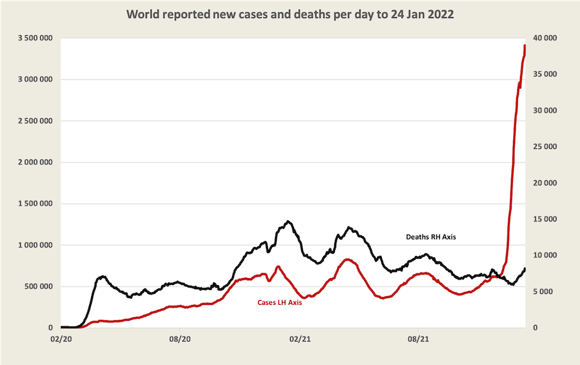
The graph below, updated from last week, tells most of the story about Omicron. It’s spreading rapidly, but it is far less deadly than earlier strains of the virus: if it were as deadly as previous variants the black line of deaths would be rushing up to the top of the chart, overtaking the red line.[1]
There is optimism around the possibility that Omicron is the pandemic’s endgame. European media have seized on a statement by the WHO European director Hans Kluge who said “It's plausible that the region is moving towards a kind of pandemic endgame” and on a remark by Anthony Fauci that “things are looking good”.
These remarks need to be seen in a wider context, however. WHO Director-General Adhanom Ghebreyesus has warned that the end of Omicron will not be the end of the pandemic:
There are different scenarios for how the pandemic could play out, and how the acute phase could end – but it is dangerous to assume that Omicron will be the last variant, or that we are in the endgame.
On the contrary, globally the conditions are ideal for more variants to emerge.
In an article in The Lancet – COVID-19 will continue but the end of the pandemic is near [2] – Christopher Murray of the US Institute for Health Metrics and Evaluation describes the epidemiology of the Omicron wave. He expects that more than half the world population will have been infected by the end of March, but official statistics will understate its incidence because the rate of asymptomatic infection is possibly as high as 80 to 90 percent. In relation to public health measures, there is little that countries can do at this stage to slow its spread:
Increasing COVID-19 vaccine boosters or vaccinating people who have not yet been vaccinated is unlikely to have any substantial impact on the omicron wave because by the time these interventions are scaled up the omicron wave will be largely over. Only in countries where the omicron wave has not yet started can expanding mask use in advance of the wave have a more substantial effect.
He notes specifically the situation in China, New Zealand (and by implication Western Australia) that have so far pursued zero Covid-19 policies: they cannot hold out for long but while they do they can get people vaccinated.
He concludes with an optimistic medium-term forecast:
By March, 2022 a large proportion of the world will have been infected with the omicron variant. With continued increases in COVID-19 vaccination, the use in many countries of a third vaccine dose, and high levels of infection-acquired immunity, for some time global levels of SARS-CoV-2 immunity should be at an all time high. For some weeks or months, the world should expect low levels of virus transmission.
The first half of Norman Swan’s Friday Coronacast – The great big lull after Omicron – is essentially a summary of Murray’s paper. It’s a lull, not the end, but with luck it may be a very long lull.
The waning of Omicron suggests there is little point in companies developing an Omicron-specific vaccine, a point made by Deborah Burnett of the Garvan Institute of Medical Research – Will an Omicron-specific vaccine help control COVID? There’s one key problem – published in The Conversation. She warns that while infection by Omicron probably provides protection against re-infection and may provide some protection against Delta, mass infection with Omicron won’t protect us from future variants. The world needs a universal Covid vaccine and Garvan is collaborating in worldwide research to this end (but it’s a slow process).
[1] Note the usual qualifications. Because the graph is based on WHO data it captures only recorded cases and deaths, and even in countries that generally keep good health records, many cases of Omicron, perhaps a majority, have not been recorded. The incidence of deaths per case would be even far less than is implied by this graph.↩
[2] A title, probably chosen by an editor, that is more optimistic about the pandemic ending than is implied in the article. ↩
Vaccine politics
Worldwide, particularly in the US and Germany, there are impassioned conflicts about vaccine mandates and other measures to enforce or encourage people to be vaccinated.
A group of researchers at Canada’s Simon Fraser University have published a paper, based on empirical research of mandates in Canadian provinces and European countries, revealing strong evidence that vaccine mandates are highly effective in increasing the uptake of vaccines: COVID-19 Vaccination Mandates and Vaccine Uptake. The Economist has a reader-friendly version of this research: Do vaccine mandates actually work?. The Economist article cites other research reaching the same conclusion, with additional findings on the effectiveness of mandates in reducing deaths and hospitalizations. It also reveals very high levels of vaccine hesitancy in the US and the UK.
The Atlantic has an article by Kurt Anderson that goes into the politics of the anti-vaccine movement: The anti-vaccine right brought human sacrifice to America. It’s an anthropological study of societies that have practised human sacrifice. These are societies, governed by authoritarian regimes, in which there has been intense social stress and an intertwining of supernatural religion and state governance. Historically in such societies victims were specifically chosen, while in present-day America the victims of the anti-vaccine right are chosen by the virus. Otherwise his comparison holds tightly.
Anderson also reports on survey data showing that many Americans, particularly those described as “evangelicals”, believe the pandemic is a punishment from God.
Australia: because we’re looking at the wrong figures, we’re unnecessarily scared
Over the seven days to Thursday 27 January, there were 489 Covid-19 deaths in Australia, close to half of them in New South Wales, and there is no sign that they have peaked. Over a full year deaths at that rate would mount to 25 000, putting Covid-19 ahead of ischaemic heart disease as a cause of death.
That’s scary.
It’s also a terrible reflection on the callous indifference of the prime minister and the New South Wales premier who let the virus rip, rather than using public health measures to slow its spread to allow time for people to get a third dose of vaccination. Many, perhaps most of these deaths, would have been avoidable.
But these figures on death, broadcast on our daily news reports, can distort our assessment of the risks associated with Covid-19. They are a distraction from the fact that while the number of deaths (and hospitalizations) from Covid-19 are higher than they have ever been, the death rate from Covid-19 is now much lower than it has ever been, and the incidence of Covid-19 is receding. For those who are fully immunised with three doses and who are in reasonably good health the risk of contracting Covid-19 and having to be hospitalized is quite low.
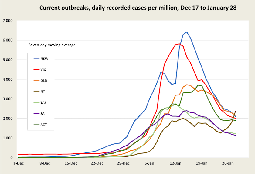
There is clear evidence that the incidence of Covid-19 infection has peaked in most states and territories, particularly in New South Wales and Victoria where the current outbreak got its start. In those states recorded cases peaked around two weeks ago. This is shown in the graph below.[3]
While cases are falling, for now deaths are still rising.
For those with the misfortune to die of Covid-19, there is around a three-week lag between infection and death. This means that the deaths occurring today relate to infections around the period 5 – 12 January, when recorded cases in New South Wales and Victoria were running at around 60 000 a day (4 000 per day per million), and were still to peak.
For those two states the graph below shows the rate of deaths per recorded case from January 1 to January 27. The deaths at January 1 relate to cases on December 11, when there would have been very little Omicron about; the deaths at January 27 relate to cases occurring on January 6, by which stage, according to New South Wales data, around 95 percent of cases in that state would have been Omicron according to the most recent New South Wales weekly surveillance review.
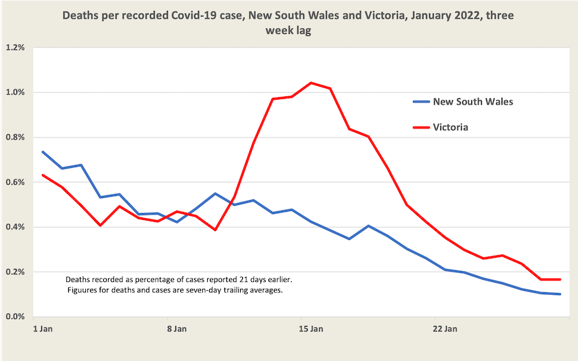
Deaths per recorded case are coming down to around 0.1 percent, or 1 in 1000. And we should note that that figure is based on recorded cases. If there is a significant under-recording of cases, as Norman Swan and others report, the death rate would be many times lower. If as Swan suggests as a conservative estimate under-recording has been occurring by a factor of 5, the death rate may be as low as 1 in 5000 cases.[4] That’s still a high figure: it puts Omicron up with the worst of influenza outbreaks, and there can be rather nasty cases that do not result in death, but it is a much better picture than we have had with earlier versions of Covid-19, when the case fatality rate before vaccination was 1 to 2 percent.
Also there are reasons to expect the case fatality rate may go on falling, as more people receive booster shots and as Delta finally makes its exit.
But for the next week or two, deaths in New South Wales and Victoria may go on rising, until that mid-January peak is passed. In other states, where Omicron took hold later, deaths may go on rising for longer.
Hospitalizations – indicators of risks and of the load on our health system
Deaths are the end of the line. Ideally, for an assessment of risks, we would be well served with data on the number of people being hospitalized and the number being placed in ICU, but for these we have data only on the number of people who are in hospital or who are in ICU (Stock variables). In a Canberra Times article of January 6 Juliette O’Brien points out the deficits in data being released by state governments. “All we get is a snapshot of people in hospital today, and we have no idea how many people went in or came out.” Economist Richard Holden, writing in The Conversation, expresses a similar frustration.
Is it that governments are so conditioned to keeping data to themselves, and to assuming that the public are too stupid to understand data, that they just don’t bother to release it, relying instead on throwing numerically challenged journalists a few scraps of big numbers that they can include in their headlines?
Within those limits, ABC analyst Casey Briggs (a journalist who is quite at home with data) has estimated that the number of people with Covid-19 being admitted to hospitals in New South Wales may have peaked. And it’s worth a glance at the hospitalization charts prepared by Juliette O’Brien and her colleagues, revealing what looks like a plateau in the number of people in hospital and in ICU, remembering that these are only stock variables. While they tell us little about Covid-19 risks, they do give an indication of the load on our health systems. As Stephen Leeder points out, writing in The Conversation (and as would be well-known by every nurse working in a public hospital), for now Omicron has overwhelmed our hospital system.
For the well-vaccinated a low risk of serious illness
The most recent data in the New South Wales weekly surveillance review (up to January 8) confirms the proposition that the Omicron variant is much less dangerous than earlier variants. For those with at least “two effective doses” of vaccine, who were infected between November 26 and January 8, fewer than 1 percent had a “severe outcome” (ICU or death). That proportion rose to 1 percent for those aged 70 to 79, and 2 percent for those aged 80 to 89. It should be noted that this covers a period in which very few people would have had a third dose: by January 8 fewer than 15 percent of people in New South Wales would have received a third dose, which is known to reduce the seriousness of infection with Covid-19 and indeed the likelihood of getting the virus at all.
The Sydney Morning Herald has gotten hold of regional data relating to third-dose uptake, and (unsurprisingly) it finds that people in the most affluent parts of Sydney, particularly in the inner north suburbs, are least twice as likely to have received a third dose of vaccination than those living in the far-flung suburbs. These affluent suburbs are also the regions with the lowest rate of infection from Omicron. Correlation does not prove causation: people in these areas may be those who limit their exposure by working from home and don’t have to be as mobile as people in poorer areas. But such stories, even if they are misinterpreted, are useful in convincing people to get a third shot and to be more comfortable about living with Omicron.
From here on – Omicron’s lull
From here on we can reasonably expect the number of recorded cases to fall, as more people receive third doses (28 percent nationally) and as children aged 5 – 11 are vaccinated (34 percent with first dose). Resumption of the school year may see another short surge in cases, and as rapid antigen tests become more available a greater proportion of cases may be recorded.[5] Whatever the path, while case numbers should fall, there is unlikely to be a sharp reduction. Calculations by O’Brien and her colleagues suggest that the virus’s effective reproduction rate (Reff) is between 0.7 and 0.8 in all states for which O’Brien keeps records. That suggests a slow exponential decline, and unfortunately exponential decline is generally shallower and slower than exponential growth. (Note the slowing in the fall in cases in the graph on case numbers.)
There is also the possibility that Omicron will be running out of people to infect. According to figures of recorded cases 12 percent of the population of New South Wales has been infected in this latest wave (it’s lower in other states), but if that is understated by a factor of 5, as Swan suggests may be the case, by now 60 percent of people in New South Wales will have been infected. That aligns with Christopher Murray’s estimate that by the end of March half the world will have been infected with Omicron (see the first item in this section).
For now Omicron seems to be something we can live with, and we should soon see some relief from its pressure on hospitals. But Covid-19 is still infecting millions of people in the world and it is still mutating.
[3] The graph, based on daily reports from state governments, understates the incidence of cases. Not too much attention should be paid to the numbers on the Y axis. But provided there is a roughly fixed relationship between recorded and unrecorded cases, it gives a good picture of the trajectory of cases1.↩
[4] The cases referred to in this analysis all occurred between December 11 and January 6, when almost all cases detected would have been in overstretched facilities doing PCR tests. There would have been hardly any data from RAT tests. So the understatement of cases was probably on the high side of Swan’s estimates. ↩
[5] But on the other hand as people come to realize that Omicron is far less dangerous than other variants, they may not bother reporting cases.↩