Pandemic politics
Cases – a tale of two states
When the incidence of cases in New South Wales and Victoria is compared, it’s hard to believe they come from broadly similar demographics, that Victoria is smaller than New South Wales (7 million compared with 8 million), and that Melbourne has been subject to tougher and longer restrictions than Sydney. (New South Wales has had substantially eased restrictions since October 11 and Melbourne came out of lockdown only yesterday.)
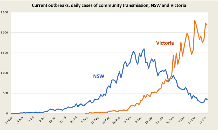
There are many speculative reasons for Victoria’s high rate of infections compared with New South Wales: it lags New South Wales in vaccination by about two weeks; its initial outbreaks were more widespread; New South Wales has had a regionally and ethnically targeted approach to vaccination; Melbourne is a more mobile city than Sydney; Melbourne people, having been subject to the world’s longest lockdown, have been less compliant than the people of Sydney; Melbourne’s weather keeps people indoors; there was a proliferation of house parties for a football final contest on September 25.
Then there is the partisan explanation: New South Wales has a Coalition government while Victoria has a Labor government.
Some experts, such as Jamie Triccas and Megan Smith of the University of Sydney are putting forward plausible reasons why Sydney’s COVID numbers didn’t get as bad as the modelling suggested, drawing on examples from other countries, while the AMA, drawing on the method used in the Doherty modelling, is warning about the possible consequences of relaxing international restrictions.
These two states are involved in a real-life experiment with a large number of unknowns. That experiment may provide confirmation or otherwise of the hypothesis that if public health and safety measures are relaxed while there is a high case load there will be a large surge in infections. If so, the next few weeks should see New South Wales suffer a lower stress on its health care system than Victoria.
As there come to be more asymptomatic cases, and as people with mild symptoms ignore official advice and fail to get tested, data on case numbers will become less reliable as indicators of the impact of Covid-19. That impact will be more reliably indicated by data on hospitalisations and deaths, for which public reporting is still somewhat patchy. Juliette O’Brien and her colleagues at Fairfacts Data are filling that gap with useful time-series data on hospitalisation.
We don’t know what will happen from here on. New South Wales Premier Perrottet has been much less cautious than his predecessor. Because New South Wales has moved early there has been political and commercial pressure on Victoria and the ACT to open up at lower levels of vaccination than they may otherwise have done.
We are living with the consequences of the Commonwealth’s hash of vaccination and its neglect of aged care and quarantine, and the New South Wales government’s inexcusable tardiness in acting on a single source outbreak – the limousine driver. Epidemiologists can hardly be expected to incorporate government neglect and stupidity into their models.
Vacination
There is a great deal of celebration about Australia having reached its “70 percent” target, but that’s still only 56 percent of the whole population. Politicians, business lobbyists and journalists in partisan media have been loosely using these “70 percent” and “80 percent” figures without qualification, because they imply that we are more highly vaccinated than we actually are, and therefore well-prepared to open up safely.
We still have a long way to go. There is a great deal of hoopla around the “80 percent” target that the ACT and New South Wales have reached, and that Victoria should reach in a couple of weeks, but that is still only 64 per cent of the population. The next obvious target would be “90 percent”, or 72 percent of the whole population. The ACT will meet that level in a few days, but at present rates it will be well into January before the whole country reaches that level, and even so it is short of the 80 percent and higher levels achieved in the most vaccinated countries.
We have become essentially two nations, one of 15 million people in the southeast, with 62 percent vaccination, the other of 10 million people in the other five states and territories, with 47 percent vaccination.[1]
Because different authorities and commentators use different bases there is confusion around vaccination numbers. Governments have used the 16+ population (20.6 million) as a base; those concerned with the population now eligible for vaccination use the 12+ population (21.9 million); internationally most countries use the whole population (25.7 million in Australia).
To provide some concordance between these numbers I have prepared the following table, with certain vaccination levels displayed.
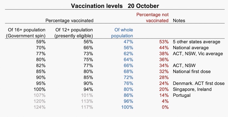
Some explanation of those notes:
- 47 percent – average of the five states and territories without circulating virus
- 56 percent – present national average and the governments’ “70 percent” target
- 62 percent – average of the three states and territories with circulating virus
- 64 percent – governments’ “80 percent” target
- 66 percent – ACT and New South Wales
- 68 percent – national first dose
- 76 percent – Denmark’s level, ACT first dose
- 80 percent – Singapore and Ireland
- 86 percent – Portugal
These are the present positions of parties in the vaccine race, and it is understandable that governments and public health authorities focus on achievement so far, but in terms of the risk to people, and the burden on health care systems, the important figure is the proportion of people who are not vaccinated – the column in red, because it is among the unvaccinated that the virus will spread most easily, and unvaccinated adults are most likely to need intense hospitalisation. To illustrate how important it is to focus on the unvaccinated, if we can move from 68 percent vaccinated (the national first dose level) to 86 percent (the level achieved in Portugal) we will have halved the number of unvaccinated.
So far, state governments have expressed enthusiasm about going well beyond the “80 percent” (64 percent) target. Many business lobbies seem to see it as the end point, however, and the Commonwealth has been remarkably quiet. It is possible that Morrison, remembering how Clive Palmer’s campaign dragged his government over the line in 2019, is counting on preference flows from the United Australia Party, now led by Craig Kelly. It wouldn’t pay the Coalition to upset the anti-vaxxers too much.
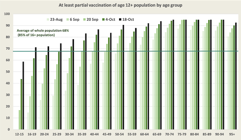
Nationally there is good progress in vaccination. Over the last two months full vaccination levels have been rising at 4 to 5 percentage points a week. The graphs below, updates from similar graphs presented two weeks ago, show vaccination progress by age group over the last two months.
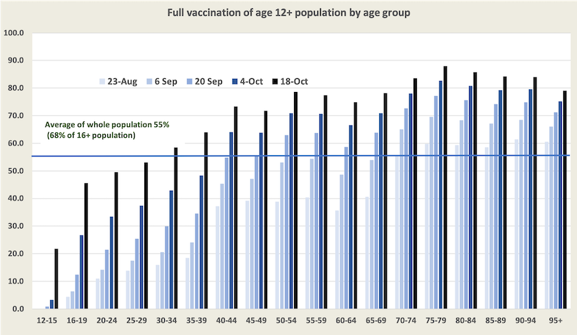
There is also progress in the uptake of first-dose vaccination: at least 90 percent of Australians aged 50 and over have had their first dose, and at least 70 percent of Australians aged 16 and over have had their first dose.
Although we are still some way off achieving even the modest target of 80 percent of the 16+ population vaccinated, it is almost certain that there will be a rollout of booster shots in the next few months (already in train for a small number of people with compromised immune systems). On Wednesday’s Coronacast Norman Swan and Tegan Taylor tell us what the researchers know about waning immunity and the optimum timing of second and third doses. Will the Morrison government be as inept and irresponsible as it has been with the first dose?
1. These figures are based on the ABC’s Digital Story Innovation Team figures for October 20, weighted by population and multiplied by 0.8 to express figures as a percentage of whole population.↩
Globally
The most easily-followed presentation of global vaccination is the New York Times vaccination tracker. Just on half the world’s population have had a first dose, and 37 per cent have been fully vaccinated. While the Americas, Europe and Asia are all making progress, the glaring gap is in Africa.
Over the last few weeks in the Australian media there has been a great amount of reporting of a surge of cases in the UK. Our media pays disproportionate attention to the UK, but in terms of vaccination, infections and deaths it is an outlier compared with other European countries. On the ABC’s Breakfast program on Friday Martin McKee of the London School of Hygiene and Tropical Medicine provided a short account of the UK’s situation: UK under pressure to reimpose restrictions as COVID cases soar.
The vaccination and death rates in high-income countries, including the UK, is shown in the graph below. The UK is clearly on its own. Its vaccination level at 67 percent is not particularly high, but it does serve as a warning to us, because this is about the level so far achieved in our most vaccinated jurisdictions – the ACT and New South Wales. The main problem in the UK is that vaccination seems to have stalled at this level, but we are sustaining a high rate of vaccination.
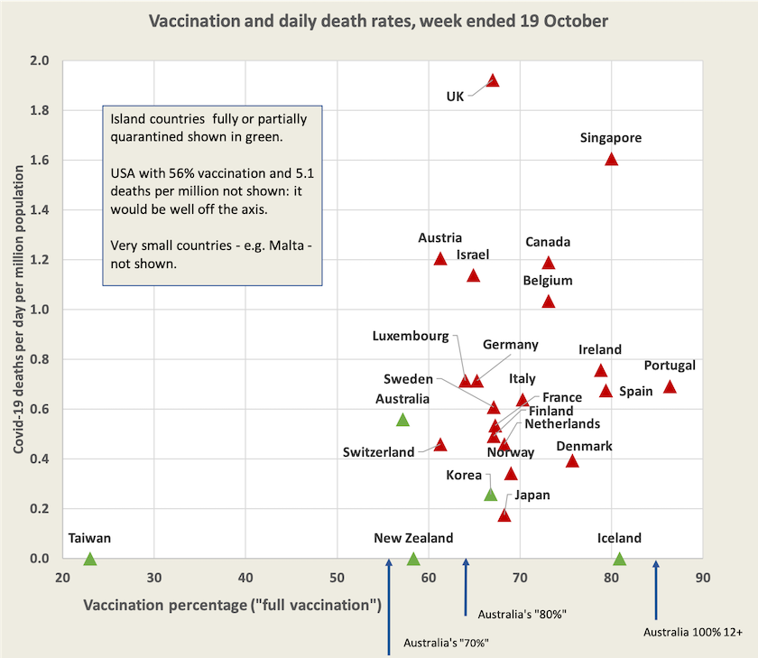
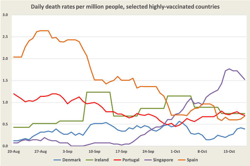
It is informative to look at death rates in the five most-vaccinated countries on the chart (not including Iceland) – Portugal, Ireland, Singapore, Spain and Denmark, all with vaccination levels of 75 percent or higher. The daily death rates in these countries is shown in the graph below. So far, over the last two months, only in Singapore has there been something of a surge in deaths, and they have responded with temporary restrictions on gatherings. The only qualification in displaying European countries on the same graph as Singapore is that in the European countries there may be some background level of immunity because of earlier exposure to Covid-19.
The tentative conclusion we can draw from experience in other “developed” countries is that we have to get well past that “80 percent” (real 64 percent) level before we can live with Covid-19 as an endemic disease without the need for strong actions such as state-wide lockdowns. Even then we might have to put up with temporary measures. A national daily death rate of 0.4 to 1.0 per million (4 000 to 9 000 a year scaled to Australia’s population) is still high, and for each death there would be a larger number needing hospitalisation. Third-dose vaccinations and better treatments may change the situation.
Data sources
See the separate web page of hyperlinks to generally reliable information and analysis about Covid-19, including data on vaccination and the WHO Covid-19 epidemiological updates.